

Apteriors awarded two projects with Galliford Try
April 12, 2019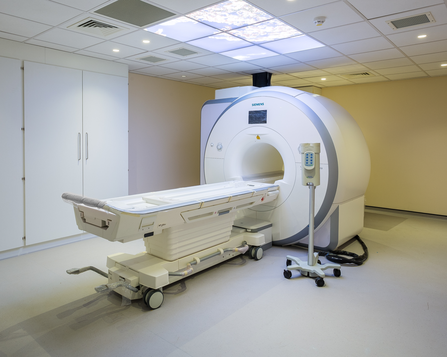
Project Spotlight: Conquest Hospital
July 11, 2019Colours Matter: Yellow
Colour has the power to transform not only furniture, and furnishings, but even the room itself.
In this series, we’ll be talking colour psychology and where/how to use colour, either in a work environment or your home.
What is Colour Psychology?
The psychology of colour is based on the mental and emotional effects colours have on people in all aspects of life. Did you know your surroundings may be influencing your emotions and state of mind? Your feelings about colour are often deeply personal and rooted in your own experience or culture.
Colours can dramatically affect moods and emotions. For example: One study found that seeing the colour red before taking an exam negatively influenced test performance.
Interest in the subject of colour psychology is growing. How powerful is the influence of colour? Can colour be used to increase worker productivity or workplace safety? Which colours have an impact on consumer behaviour? Do certain personality types prefer certain colours?
Whilst researchers continue to explore such questions, you can get stuck into Colours Matter Blog and discover all you need to know.

Our first colour to kick start ‘Colours Matters’ is the bright and cheerful Yellow.
Thanks to it being the lightest hue of the spectrum, in colour psychology yellow is associated with words such as ‘uplifting’ and ‘illuminating’. It offers hope, happiness, cheerfulness and fun. In almost every culture, yellow represents sunshine and warmth. Studies show that the colour yellow can increase mental activity and muscle energy. It helps activate memory, encourage communication, enhance vision, build confidence, and stimulate the nervous system.

Wow! Seems like everybody needs a little bit of Yellow in their lives!
But before you rush off to buy everything yellow, hoping it will do all the above, too much yellow can cause loss of focus and makes it hard to complete a task. On the flip side too little yellow causes feelings of isolation and fear, insecurity, and low self-esteem. It’s all about balance, it seems.

Overall, yellow captures the joy of sunshine and communicates happiness. It is an excellent choice for kitchens, dining rooms and bathrooms, where it is energizing and uplifting. In halls, entries and small spaces, yellow can feel expansive and welcoming.
Yellow is great to balance within white furnishings; it adds a bright lighthearted touch to any space. The white keeps the look fresh and simple, while the colour adds contrast and depth, which can be seen in the picture of Bedroom 2, this is a residential Project Apteriors recently worked on called The Otto, the project also included a school (see below).
Yellow was chosen for this year 2 class as yellow is generally said to be lively and energetic, evoking positive emotions that are associated with summertime. We wanted the room to promote an exciting learning environment for the child and encourage creativity. The accompany of orange allows alertness and attracting a child’s attention to details. See full case study here.

Fun fact: Coldplay achieved worldwide fame with their 2000 single “Yellow”. It is a song that associates things the singer sees with the colour yellow.
Come back next month for our next colour spotlight!