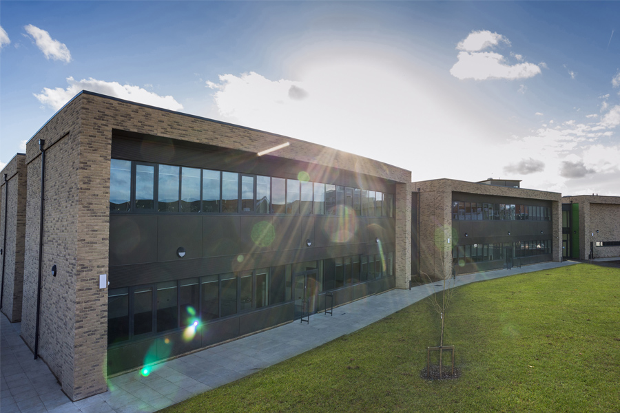
Green Park Village Primary School is part of the signature Green Park Village residential development by Berkeley Homes, in Reading UK
project size
0msq
ff&e budget
£0k
number of items
0
PROJECT DETAILS
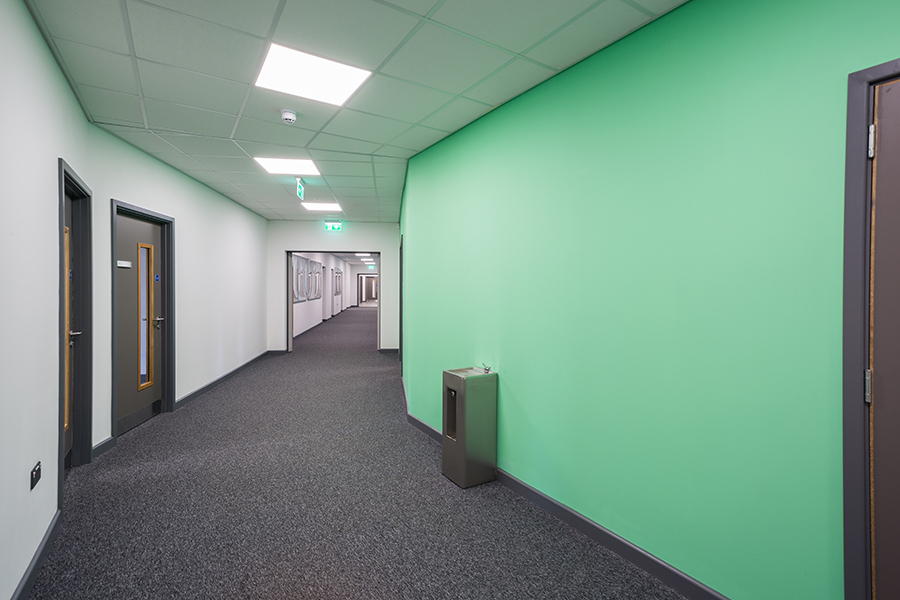
The building itself is a two-storey Architectural Centrepiece, built using volumetric modular construction by our client Reds10. It employs SMART technology and is a true showcase of what this construction method can achieve.
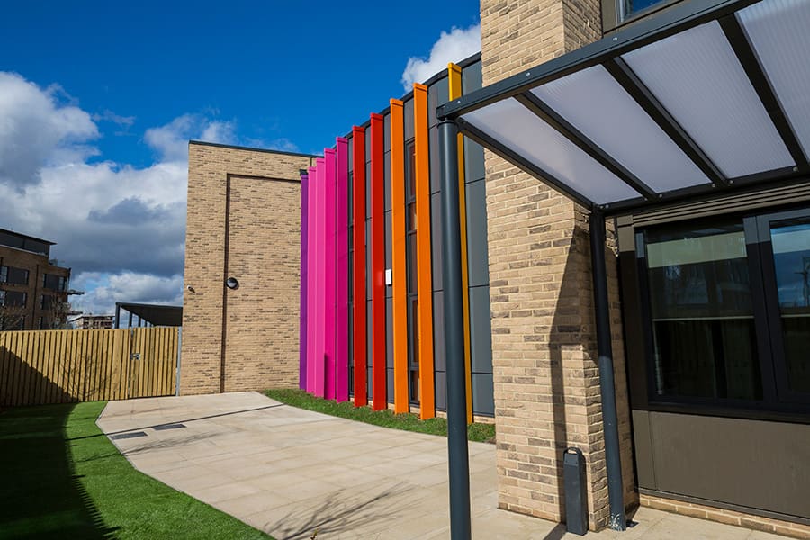
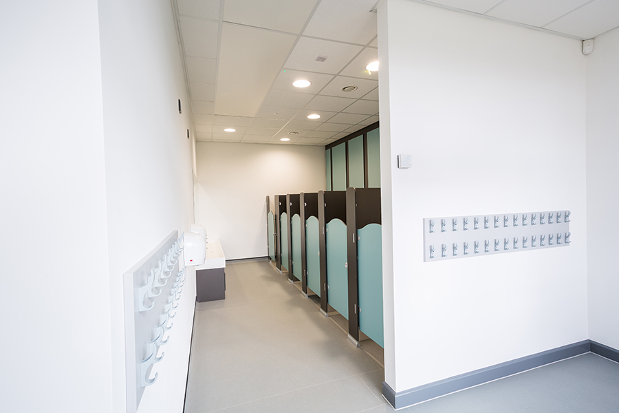
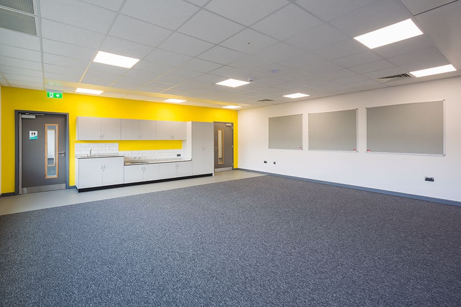
As such, one of the key aims of the design was for the bespoke wall mounted and fixed furniture to be fit for purpose across spaces for both pupils and staff, while drawing on the uniqueness of the exteriors.
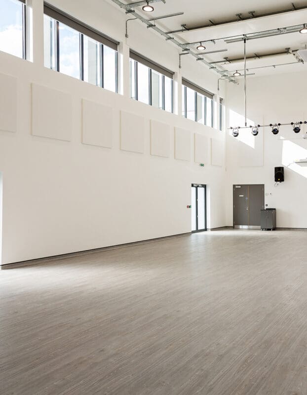
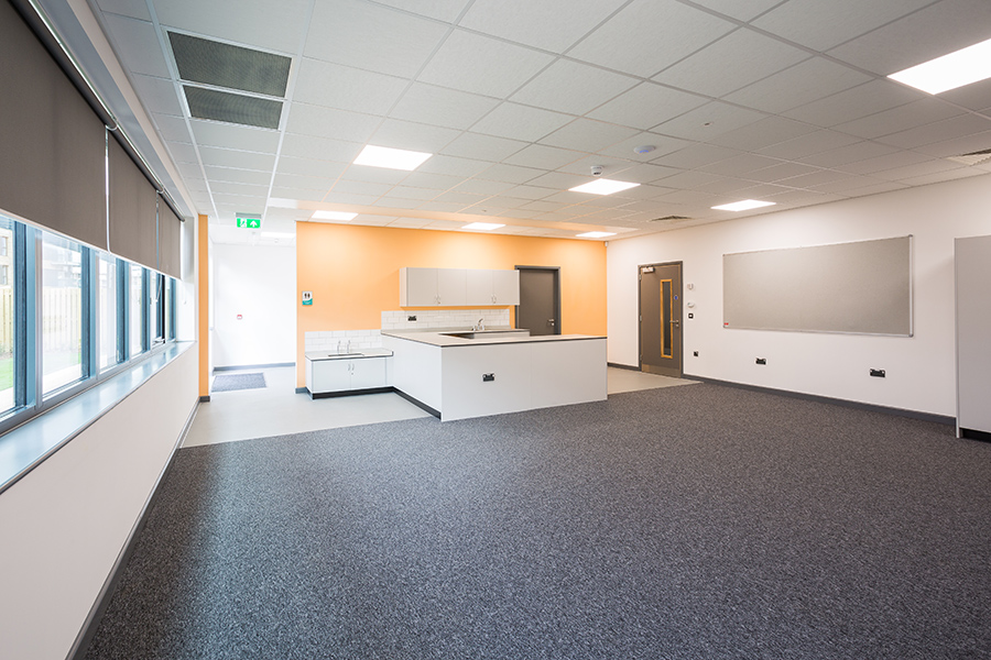
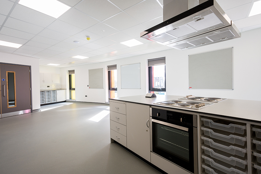
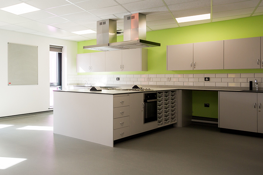
Taking the project from initial design to end installation, while ensuring full BIM Level 2 compliance, we created a set of sleek classroom spaces, which enclose various storage systems suitable for both practical and theoretical learning.
The brand-new school facilities will allow the school to offer their unique curriculum, focused on practical, hands-on leaning in dedicated specialist teaching spaces.